Printing the broadside, Wednesday & Thursday

Having set all my type, both the roman and italic blocks, I went to set up on the Vandercook Universal #4, a different model than the one we'd learned to operate on Monday. Similar, and basically the same in terms of the tympan cylinder, the crank and press bed, but with a few key differences it baffled me for several minutes until Nancy straightened me out. On this model, the trip/print lever is different, the rubber rollers adjust via screwdriver (instead of knobs), the inking rollers come completely off the carriage for cleaning (instead of raising on a hinged lever), and you need a wrench to change the packing or tympan paper, which also has to be taped to its winding rod (whereas the other model had a slot for the tab you cut into the paper). That's a pic of Uni 4, above.
I carefully moved the set type (which I'd secured with twine around the outside of the block to keep it more stable--all the little pieces can tumble if you're not careful!) to the press bed. After the type was on the bed, the twine is removed and the spaces around it are filled up with appropriately sized furniture. Like setting the type and adjusting spaces for a tight line, building the furniture in the bed is like a giant jigsaw puzzle, except all the pieces are rectangular. In the picture above, you can see the rectangular blocks of wood and a few metal ones, around a centered block of type. (I snapped this pic when another student was printing birthday cards.)
As you know from the last post, I chose to print the roman lines first. They begin higher on the page, right after the title. Since I was doing the title in a different color, I hadn't set it yet. And I needed to leave space for it on the page. So I used two blocks of furniture between the top of the press bed and the top of my first line. The furniture is based on a pica system, so placing pieces in combination will give you fairly precise measurements. Handy, no? So below the title space, I pushed the block of type up to be flush with the furniture. I also built some furniture over to the right, and pretty much centered the block on the press bed. (This doesn't have to be exact--you can adjust the paper position on the cylinder to center the printing later.)
 Because I was printing the roman lines only in this first pass, I also needed to build in leading space for the italic lines to come between them on the next pass. I grabbed a bunch of 30 pica-long furniture pieces--the narrower ones called reglets--that were all the same pica-height. I'd laid the poem out on my computer in Quark the night before, and had printed a copy--in the same fonts and point size--to use as a guide. So I was able to measure the amount of leading between the roman lines there, and build the furniture to suit it on the bed. I even tried out some paper and ink colors in the electronic document (though I ended up changing my mind about the paper color later). After the leading was set on the press bed and the right side was built up, I built the left side, leaving space for the quoin--a metal spacing bar that expands by a turning key to lock everything into place. This press also had a lockup bar, which serves a similar purpose to the quoin, with a tension lever to exert pressure on the furniture and set block of type, from the bottom. I locked everything into place, and checked the stability of the type by wiggling it left/right with a fingertip at various points on each line. In a few cases, what had seemed tight on the composing stick was now a little loose. You don't want the letters to move at all, as the rubber rollers ink them, and as the paper rolls across them carried by the cylinder. So I inserted coppers or brasses in the appropriate spots (ends of lines, not between the words) with tweezers. When everything was sufficiently tight, I leveled the type gently with a wooden block called a plane. Here's a pic of another student planing their type, below. This step is to make sure all the letters are sitting flush on the press bed. It's imporant they're all at the same height, or they will impress differently onto the paper. Too high and they get too much ink (and the surrounding letters don't get as much) or even press clean through the paper.
Once the type was planed, I turned the quoin key and shifted the lever on the lockup bar, so all my pieces were stable and tight in the press bed. Cool. Then I inked the press. I turned the power on, which rotate a big metal roller in the base of the press, and also runs the gears on which the inking rollers turn with they are in the home position. The press is cranked by hand, so these are the only motorized elements. With the inking rollers disengaged, I dotted my ink along (which I'd mixed to match a Pantone swatch I'd selected earlier) on the front small metal roller with a palette knife. (The smallest roller, visible in the planing pic.) I engaged the rollers to let them turn together, and the ink was transfered to the larger metal rollers and the rubber rollers underneath, as well as the metal roller in the bottom of the press. I did this a few times, until all the rollers looked evenly inked. At that point, I'm ready to run my first proof, and check the impression, inking, and roller height.
Since part of the proofing process is making sure the type is impressing the paper evenly and with enough force, it's important to use the same weight and texture of paper on your proofs. I didn't have much of the Canson Lime--15 large sheets, cut lengthwise in half gave me only 30, and I figured some of those would be wasted in mistakes or misprints. I hoped for at least 20 perfect prints of the completed broadside. Since I had to run each broadside three times, once for roman lines, once for italic lines, and once for the title block, there were many opportunities to screw something up. So I used a more abundant color of the Canson paper, cut to the same size. I ran a test proof, and flipped it over to check the impression on the back. You could see each letter clearly, but not too much. So the packing paper under the tympan paper on the cylinder did not need to be adjusted. Lucky me. (If the impression had been too deep, I would have needed less packing paper on the cylinder. Too faint, and I would have needed to add a sheet or two.) So far, so good.
Next I checked the front of the proof. Ack. I had a b instead of a d in "The back stairs smelled like soup." I think it must have been missorted in the type case, or perhaps I grabbed from the wrong cubby. So that letter had to be switched out. Amazingly, otherwise the type looked good. No upside down s's or o's, no u's for n's, etc. (I realized later that it made perfect sense that the roman type had fewer mistakes on my part than the italic, since I'd set it second, after I was a little more experienced. The italics will be a different story, but I don't know that yet.) The roller height also seemed good--the type was clearly and evenly impressed and inked at both the beginning and end of the line. Had it not been, I would have had to adjust the roller height to vary the amount of contact the rubber rollers have with the block of type as they pass over the bed. There are two rubber rollers, and each adjusts at each end, so there are four variables when making these kind of adjustments.
However, I wasn't quite ready to start printing on my Canson Lime. I noticed the ends of the lines were higher on the page than the beginnings. In other words, not quite parallel to the top and bottom edges of the paper. The whole poem was canted. Also, I wanted to center the lines on the page, or mostly center them. I knew the poem's longest line was one of the italics lines, in the second pass, and that the italics were actually indented a bit from where the roman lines began. (See Quark layout pic above.) Hmm. It couldn't be the type that was off, because everything was flush in the bed. So it was the paper position that needed to be fixed.
At the top of the cylinder are grippers, to hold the paper in place as the cylinder is cranked across the bed. They are opened by means of a pedal at the base of the press, and snap open again when the cylinder carriage reaches the far end of the bed, so you can remove the printed paper before cranking the carriage back to home. Between the grippers (which look like giant nailheads, but slightly domed) are adjustable guides that the top of the paper sits against. Also on the paper-feed table is an adjustable side guide. I moved the side guide in a few times and ran a proof each time (on that blue practice paper shown two posts down, since I wasn't testing for impression or inking at this point), until I had the lines centered, and the left and right margins correct. Then I went to work on the top guides, to fix the canted line height. This was ridiculously confusing at first. The adjustable knobs have numbered hashes, but on this particular machine, much to my frustration, the numbers didn't bear much relation to each other. 7 on the far knob was not 7 on the center knob, etc. Sigh. Also, as with many elements of the letterpress process, you're required to visualize everything in mirror images. Lowering the right side of the page would raise the ends of the lines further. Oops. (I was totally frustrated at this point, and then suddenly, I got dizzy. What the? I looked at the clock. It was almost 3:00 and I'd been so absorbed, I forgot to eat lunch. Luckily I had a nutrition bar in my bag. I ate that and got a glass of water. I wasn't about to stop now! Ten minutes later I felt much better, and everything made sense again.) Raising the right side of the page lowers the line end. Ah ha, yes. Eventually I got the lines straight, which I confirmed with my trusty pica stick. Whew!
I cleared the paper feed table and got my Canson Lime ready. I started printing. It was really thrilling to take the first perfect print from the cynlinder!
Once I got started with the actual printing, things were a breeze. I loaded each sheet on the cylinder underneath the grippers, cranked the carriage to the end, and removed a perfect print. I noticed at one point that the penultimate line was printing a little lighter than the others. I couldn't figure out why this would be, since I'd checked the packing to make sure the sheets were long enough to accommodate my long narrow page shape. Hmm. I inked the machine a little more, and that helped some. Nancy taught me a great trick the next day, when I was printing the italic lines, that I could have used to fix this problem: cut another piece of tympan paper, a little longer than the line you want to emphasize, and a little taller than the line, but not so tall as to overlap with the lines above or below. With a printed copy of the broadside on the cylinder, you tape this piece to the top sheet of tympan paper on the cylinder, right under where your light line will hit the cylinder. As a result, the force is greater for that one line, by virtue of the additional paper thickness. Voila!
I ran 28 clean copies of my roman lines and it was time to break down and clean the machine. The next day, I'd be first on the press, to do the italics lines. I'd decided to do these in the same color, but a slightly darker shade of the same teal ink I'd mixed before, so I adjusted it by adding a touch more black ink. (The difference is actually pretty subtle in the finished piece--I could have stepped down another degree. But as I mentioned before, I didn't want to do a whole new color. I was afraid the italics would be overemphasized.) It was a bit more work to set the italics up on the press, because I had to adjust the position of the block on the bed, inserting leading as before, but with a little additional space at the top so that the first italic line would come midway between the first and second roman lines. I managed that fairly easily, with the reglets and furniture, but I had the same problem with the lines being canted, so had to fiddle with the gripper guides again. I also had to adjust the roller heights on one side, raising them to deliver less ink to the beginnings of each line, which were getting more ink. Nancy taught me the trick for the lighter penultimate line (which we figured out was because of the length of my piece--it almost maxed out the tympan circumference and the end of the page was slapping a bit at the end, instead of rolling gently. The extra piece of custom-cut packing paper did the trick. At one spot, about two-thirds down the page, the roman and italics lines suddenly shifted in relation to each other. Nancy and I checked the italics in the bed and all looked good. We switched out a couple of the leading reglets and got the same results. There must have been a reglet off in the roman pass the day before--sometimes the wooden reglets get a bit compressed over time, from use and the pressures of the quions and lockup bar, etc. So we cheated the leading there a bit, with some very thin metal leaders. It's still slightly off in the finished piece, but really only detectable with a pica stick. Most people wouldn't notice it with the naked eye.
 Since I set the italics first, there were all kinds of goofy errors, my own and those of the missorted-type variety. (Click for a bigger image.) I had placed the l in "School" and an a in "woman" upside down, used a d instead of a b in one instance of "public," used a 1 instead of a 7 in "Lot 3057," and an ffl instead of an ffi in the second "Office." (The letter combination ffi, ffl, and ff are available as single blocks, because the tails for the two f's would overlap problematically if set as separate letters, and the dot on the i would also come too close to the top tip of the f. Some of those were cases of missorted type, as was the capital W in the seventh line--it was a totally different typeface and had been erroneously mixed in with Baskerville. One P was also another typeface, as were several lowercase f's. Three y's had broken tails (though it doesn't look like I caught those until a later proof. But you can see it in "system" in the first line, compared to the one in "Nudity" on the last line, for instance.) So all of those had to be switched out, and the type replaned and reproofed. The upside down letters I certainly could have caught by looking more closely at the type block itself, but the mismatched typefaces are more difficult to spot without a test proof, if the typefaces are similar, since everything it backwards and upside while you're setting it! And alas, letterpress has no spellcheck function.
 Those things fixed, I worked on setting the position on the page, relative to the roman lines. I used some of the roman test proofs, which I'd saved from the day before. I got eveything how I wanted it, using the gripper guides and side guide on the paper feed table, and started printing the italic lines. Again, the set up takes much more time than the actual printing, unless you're doing many more copies than I was attempting. (I could have done more, I guess on a different color paper, but my project was so complicated, I didn't want to hog the machine more than necessary while others were waiting.) With the italics done, I just had the title block to set and print. It was short, so I'd done it that morning before I got on the press, and I'd also mixed my ink, a reddish orange. I pulled the italics off the machine and set the title block, up at top of the press bed, but leaving much of the furniture on the sides as it was (since it was already centered). I didn't need all of the furniture at the bottom, since the title block was much shorter than the roman or itals, so I put those pieces away.
 Before I could start printing, however, I had to change the ink color. That meant I had to clean the entire machine and re-ink the rollers. That takes about a half hour. But printing the title itself was relatively easy. I'd changed the styling of it a bit from the Quark version, because the Baskerville italics I'd wanted wasn't available in the point size I'd chosen. I mean CBA just didn't have it in that size. So I stepped down to the next largest size of the Spartan Black Condensed (48 pt.) and used 36 pt. Baskerville Italics and built up the spacing as necessary to make the block square. I also decided to put my name up at the top--this was mostly for expediency. I was going to put it at the bottom, as is traditional, but I would have had to build more furniture in the press bed, etc. The bigger point sizes and thick bodies of the letters in the title required a little more pressure than the italic type had, so I added a sheet or two of packing under the tympan paper. I also adjusted the rollers on the side corresponding to the ends of the lines, so that those largest, densest letters would get more ink. It was fairly easy to get the title placed on the page, since I knew the grippers were already correctly aligned from my last pass. All I had to do was fiddle with the side guid on the paper-feed table until I got the title lined up with the edge of the roman lines. I did have the S in my name upside down at first. Sheesh.
But after that, all went pretty smoothly. And yes, I did do a little dance when the first perfect print came off the press.
[Monday, I'll put up some more photos of other people's work, show you the napkins and notepaper I made on Friday, and wrap up the letterpress report.]
Labels: letterpress
posted by shanna at
7:33 AM
|
0 comments
![]()
![]()


 I'd love to tell you what happened next, about my time on the press. But I overslept a bit and have to get going. Suffice to say at this point, that I managed to print the roman lines of my broadside: 28 copies on Canson Lime in a custom mixed Pantone dark teal blue (16 pts. Process Blue + 6 pts. Black). [You can see the ink color on the practice proof above--click it for a bigger image--but the paper there is not the real deal. A swatch of Canson Lime is shown at left.] I'll be doing exactly the same thing today, for the italic lines, so those notes will explain the press set up, ink mixing, printing process, and how to clean the machine. I got more practice on the type case because I had to sort all of my roman lines back into the drawer before I left!
 A few concerns immediately presented themselves: the poem repeats the word "woman" (or "women's" in one case) twelve times and the word "public" seventeen times, not including the title (which will be set in a different typeface). So I couldn't just pick any old typeface. Some are more popular than others, and in addition to the classes at CBA, there are also former students and other book artists renting time in the studio, and some of the type is tied up in these other projects-in-progress. I wanted to stick with a classic
 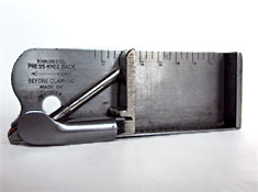 The composing stick is a tray with high sides on the bottom and right and open at the top and left. The top is ruled, and the removable knee slides along the bottom edge and has a tension lever to help you keep your set type in place as you compose. One begins at the top of a block of type, setting the type with the letters upside down. My first line to set, then, was the penultimate line of our poem, the one for the letter Y. (I'd missed the part where Nancy said we could make up new text for our letters if we chose, so I just followed the book. Even though I hadn't read the rest, I could tell from this line, the object of the book was not only to teach the alphabet, but to entertain via rhyme and rhythm, as well as function as a kind of which-of-these-does-not-belong game.) Going from left to right, but facing my letters upside down and looking at their backwards forms, I composed: YELLOWHAMMER, Eagle, Hyena, Lark. Conveniently, the line and spacing I chose fit perfectly on the 30-pica (that's 12.7 centimeters) limit Nancy had set.
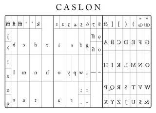 I stacked up a couple of leaders, for space between the lines, and set my second line: ZEBRA, Chamelon, Butterfly, Shark. The type case map was extremely handy for us newbies. Think of it kind of like a keyboard: the letters are arranged in positions related to their frequency of use. Vowels get bigger cubbies--with the lowercase e getting the biggest, and numbers and skinny letters like lowercase l make their homes in narrower pockets. (Luckily, the type case maps Nancy gave us were not printed with reverse images of the letters like the example above. It's tough enough to be sure you're spelling chameleon correctly upside down and backwards without having to use a topsy-turvy case map! Soon enough, we'll all be reading backwards. I may even take up mirror writing.)
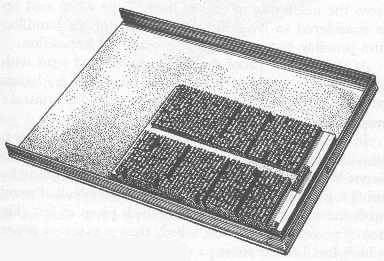 Since I only had two lines to set (others had 4), I also set the X and W lines, just for more practice judging spacing to fill out lines and to get more familiar with the type case. My fingertips were grey, at this point, from the metal and probably ink residue (though the type is cleaned with alcohol after each use). Everybody finished up around the same time, I pulled my two extra lines and sorted the type back into the case. Nancy came around with a galley--a tray to collect all the set type. It's got raised rims on all but one side, and holds your composed type as you arrange it in a completed block, tranferring a few lines at a time from your composing stick. Then we learned how to tie the block, wrapping twine around the outside of the type (while it was still on the galley) and tucking one corner with a copper. We transferred the block to the bed of the press and broke for lunch.
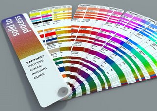 After lunch, Nancy showed us the shelves where the rubber-based ink for the letterpresses are kept. The colors are organized on a Pantone system! Very groovy. She opted for basic black as a demo, and showed us the ink's body, moving it around on a plexiglass plate with a palette knife. It's very thick, and a little goes a long way.
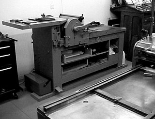 I forgot to note the model number, but we were using a Vandercook, similar to the one at left. It's got two sets of rollers, in addition to the tympan cylinder, which carries the paper. Nancy inked the press by dotting just a teeny bit of ink from the corner of her palette knife (this may have a more official name in printing, but it's a basic putty or palette knife with a flat squared shape, maybe an inch or so wide) onto the smallest front roller, which is metal. She flipped the switch for the roller motor (the press is cranked by hand, but the rollers are motorized to enure even inking) and the ink from the small front roller was transferred to the larger metal roller, the one that will come into contact with the type on the bed. Then she ran a couple of test prints, and showed us on each how to look at the impression on the back of the paper (apparently fine letterpress artists used to try to minimize the impression, but people came to value the raised effect on the back of the letterpressed page as a distinctive quality!), and where we might need to tighten lines with brasses and coppers or replace type that was worn or nicked. A couple of folks got letters like S's and O's upside down. She adjusted the height of the rollers and showed us how to measure roller height with a metal tool called a lollipop. The rubber rollers determine the amount of contact and pressure between the paper and the inked letters. Some of our letters were coming out faint or not inked at all, but the impression was good, so we knew we had enough packing (paper padding on the tympan) but needed the rollers to be adjusted. After 5 or 6 test prints, everything was set to her liking, and we each took a turn cranking the press. (Did I mention we signed liability wavers? Yeah, you could injure yourself on one these things, but they're really not all that scary.)